How To Conduct An Email Design Audit

Email marketing is all about sending the right email to the right audience at the most opportune moment. The effectiveness of an email campaign is only evident 48 hours after a campaign is sent. Since there are many moveable parts in an email campaign, it is not easy to deduce what went wrong. Taking the time to periodically audit your email campaign can help you polish the kinks developed over time in terms of engagement.

Learning about performing an email campaign audit would be an exhaustive affair in a single sitting; we shall only be focussing on the email design audit aspect for this article. You shall learn about what is an email design audit, why you need to audit your email templates periodically, what parts of email design should you audit and the common mistakes that surface during email template audit. 

What Is An Email Design Audit?

An email design audit is a part of a series of complex processes to appraise the current email marketing strategy and point out the flaws in the email campaign performance. Email design audit assesses existing email templates and looks into the various components that come together to create an email template such as subject line, layout, colors, images, etc.  

Why do you need to do an email marketing audit?

Email templates are used continuously for repetitive uses such as newsletter templates, welcome emails, transactional emails. As time and trends change, it is important to refresh your designs to avoid monotony. Yet opting for new email design, every time you observe a dip in the metrics is not a cost-effective alternative, even if you choose for our affordable email design services.

By periodically auditing your email template designs, you can pinpoint on the non-functioning component and invest resources in correcting them. 

Which Email Design Components Should You Audit?

While auditing any email template design, you need to be analytical. Not only do you need to check for the visual aesthetics of the different elements, but you also need to check the effectiveness of the placement and functionality. One of the best ways to identify the various components of the email that can be analyzed under a template audit is looking for those components that can be A/B tested. Some of the most common email components that are audited in an email template & the question you need to ask for each are:

  • The Email Layout Is a single column layout following the visual hierarchy your emails need? Would a straight layout or zig-zag work well in showcasing your images?
  • Width of the email Is it worthwhile to create a full-width email? Should you focus on mobile layout only?
  • Fonts Is my layout getting affected when using a fall-back font? Which font matches my brand personality?
  • Subject Line & Preheader Does using emoji improve engagement rates? What is my optimal subject line length?
  • Images & GIFs Are my images retina-friendly? How many subscribers can view my GIF? Is it affecting the loading time? Are my alt-text self-explanatory? Is creating a pixel art a good move for your email campaign?
  • Email Copy Am I formatting my email copy for maximum readability? Do my salutations need a personalization tag? Will my dynamic content block display the correct information?
  • Interactivity How is interactivity influencing the user experience? Is the time invested justified when compared to ROI?
  • CTA It is my call-to-action copy ‘actionable’? Is the button distinguishable when I squint my eyes to read the email? Is the placement optimal?
  • Unsubscribe Link Is the unsubscribe link prominent enough? Is it complying with the CAN-SPAM guidelines?
  • Footer What information should I provide in the footer? Should I include an image with the signature? Which social media profiles do I feature for more social engagement?

How To Audit An Email Template

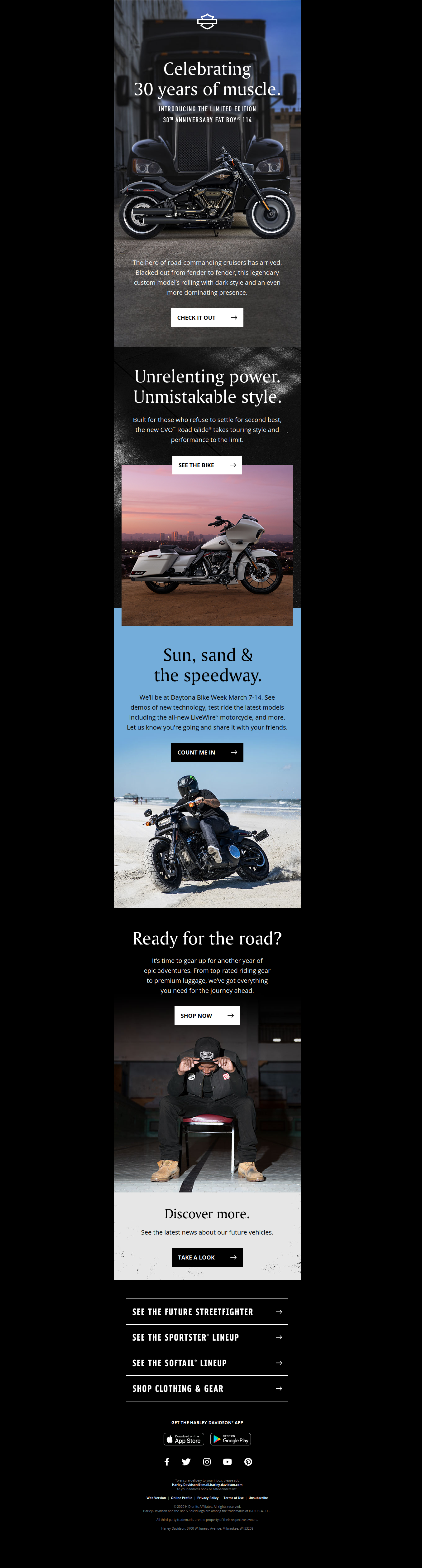
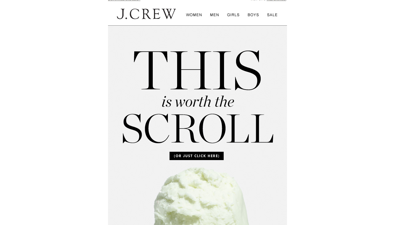
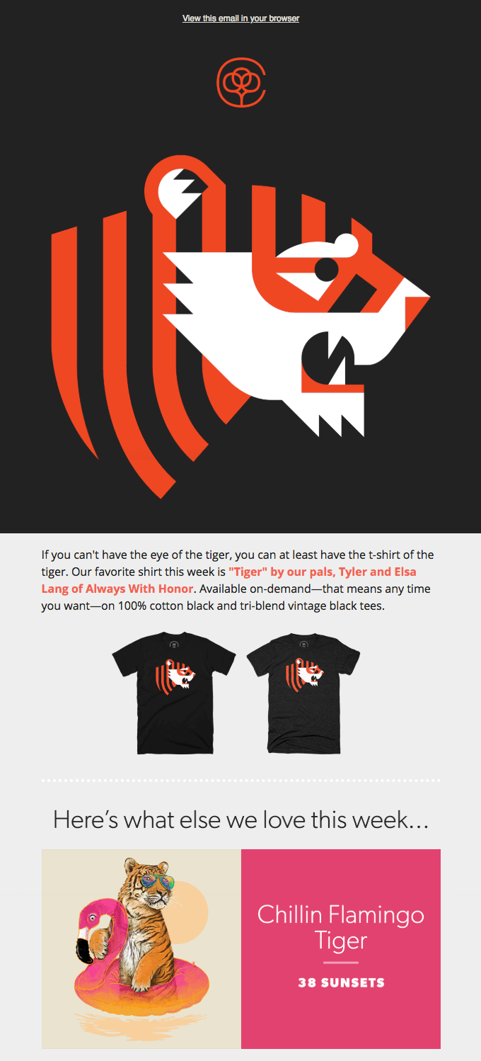
When auditing email templates, it is a good practice to divide the design into individual sections to avoid getting overwhelmed. Let’s learn by auditing a sample email template from Callaway Clubs.

The email, in its entirety, looks like this.

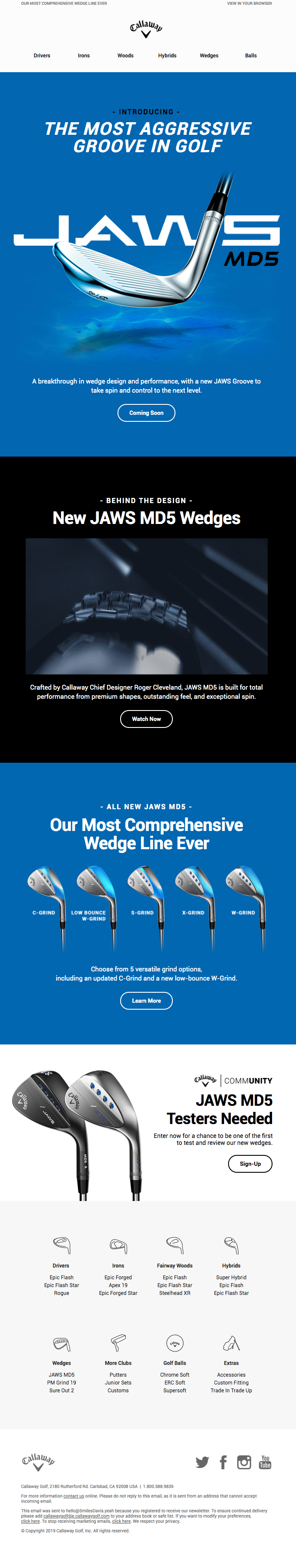
(Source: ReallyGoodEmails)

Breaking this email into bite-sized sections, we get:

The Header

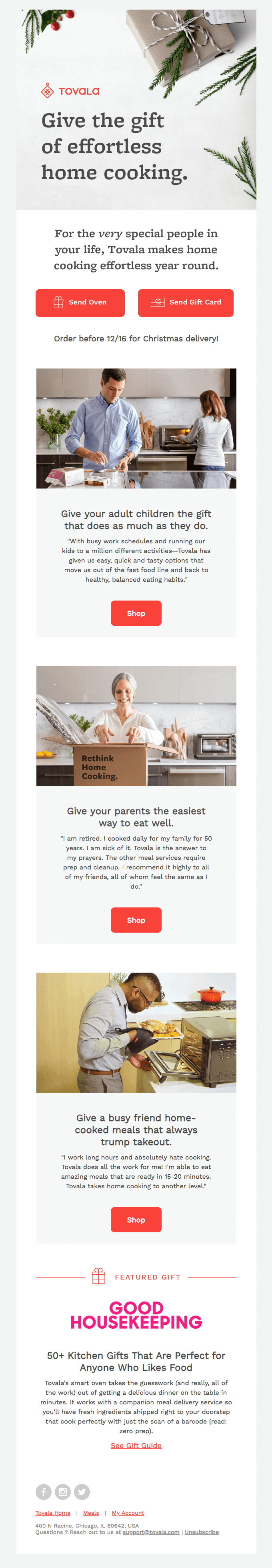
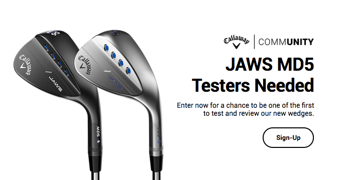
The first thing anyone notices, as soon as they open the email, would be the header portion. It needs to be powerful enough to motivate the subscriber to read through the rest of the email. In the example above, the brand logo gives recognition, the preheader provides context, and the bold headline introduces the product they are promoting. As the headline has a different background color for easy distinguishing. A minor alteration possible here is the placement of a brand logo can be in line with preheader text and view the online link. This would save a lot of white space.
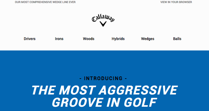

The Hero Image

Second, comes the hero image. A bold picture depicting the product or something in context with the email helps you set the theme of the email. The only thing you need to care while auditing the hero image is to ensure they are retina compliant images as they are the image in your email that will capture the most attention.
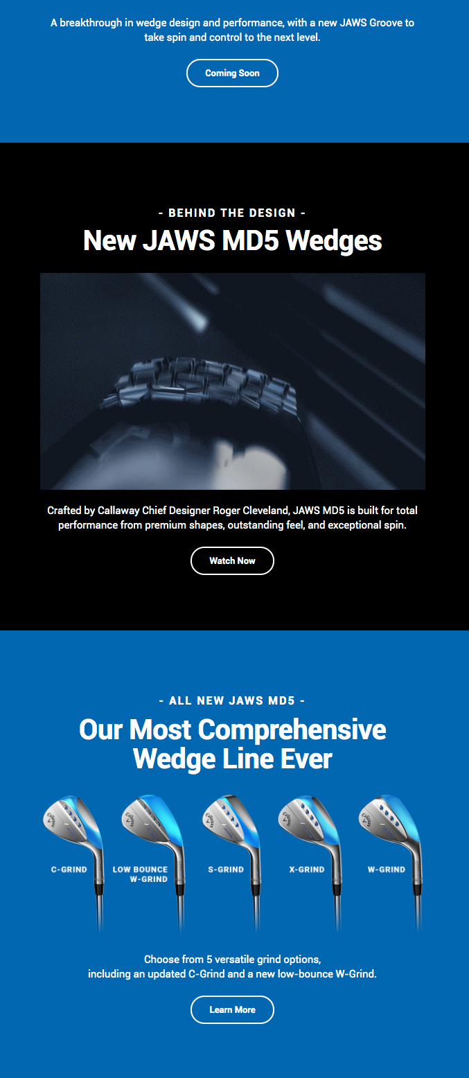
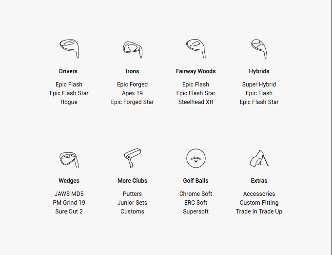
The Email Body

Once you have delighted the subscriber with the hero image, the email body begins. Here is where you build upon what was teased in the first half of the email. In the above example, there are too many sections with a call to action to individual pages. While this is not blasphemy, it is advised to have a single focus on the product you wish to promote. What was achieved here could have been managed by creating an upselling section, as shown below.


The pitch

The promotion aspect of the email is an excellent way to increase customer engagement. The section is well designed with a clear image of what the subscriber can win. Additionally, the headline is also crisp and to the point explaining what can be expected from signing up.


Upselling Section

Any email is an opportunity for upselling/ cross-selling waiting to be grabbed. A clear image, a description with a possible link, is a great way to design this section.
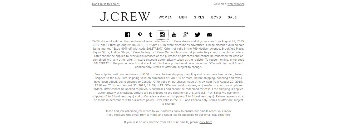
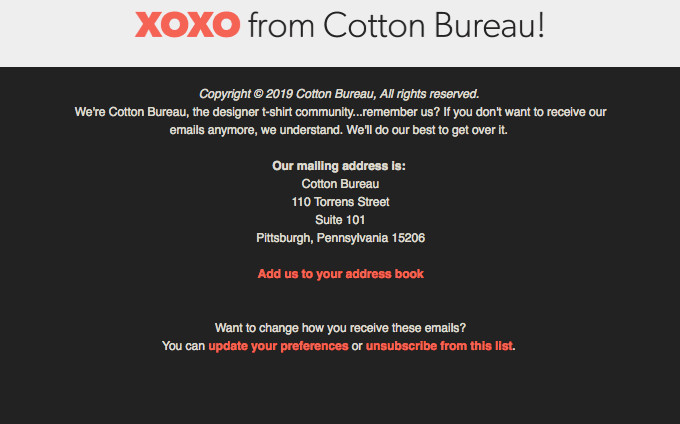
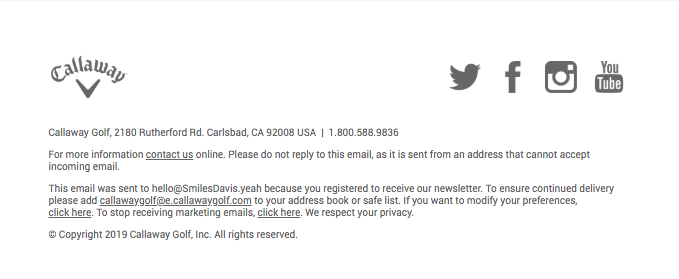

Footer

The footer should be following all the best practices of creating a CAN-SPAM compliant footer. This means it should have popular social media links, an unsubscribe link, the physical address, and the link to modify preferences.

Common Mistakes In Email Template

No Text to image ratio Certain brands tend to stuff all their information in a single image and end up sending a blank email as the email client disables the images. It is always advisable to maintain an 80:20 text to image ratio.

More aesthetic, no value Marketers in the pursuit of visually alluring the subscriber tend to overlook additional value to the email. An email newsletter should educate first and promote later. 

No formatted email copy Some emails feel as if the marketer just blurted out the message without considering to format it. This not only makes it difficult to read but also reduces the interest level. Divide your email copy into paragraphs and provide ample white space.

Not A/B testing You may not always read what your subscribers want. If you fail to A/B test your email templates, you are trying to force your ideology onto your subscribers, and this can lead to reduced interest and engagement levels. 

You can explore more common design mistakes in our blog on Common Design Mistakes.

Wrapping Up

Conducting an email audit is crucial. The consistent effectiveness of your email campaigns depends on if and when you have the time and resources to run an audit. While self can manage most of the design audit, sometimes it helps to consult an expert. It not only gives your email design a fresh perspective but also enables you to unlock new features you may have overlooked. In case you are looking for an expert, look no further. QeInbox can help you.

5 Common Mistakes You May Face While Designing An Email

Ever since emails progressed from plain text emails in the late ‘90s, the emphasis went from what you convey in your email copy to how you convey it in your email design. Email design has become an essential factor to consider when measuring user experience. Email design not only improves the visual quality of your email but also aids greatly in making it accessible. Hence, when it comes to email design it is important to steer clear of common pitfalls and easy-to-avoid design faux-pas.

This article shall focus on listing the most common mistakes you may face while designing an email.

Mistake #1: Claustrophic 600px email width

While email was beginning to be used as a communication channel for the masses in the late 90s, the maximum display screen width was 1024×768. So email designers had a limited screen width of 600px to design their emails. Later on, with the increasing demand for responsive email designs, it was considered a best practice to keep a maximum width of 600px to ensure the email looked crisp on retina displays. Modern technology has progressed to the extent that modern mobile devices have a 1080×1920 resolution, so the designers are free to utilize the additional space.

Yet many email designers today also, commit the mistake of creating an email of 600px. This results in an email of 600px with white borders on either side. This is a huge turn off from the visual perspective.

Correction: Stick to placing content in a width of 600px but create a full-width email wherein the background extend till the screen width. In the below email example by Harley Davidson, the black background stretches through the entire width of the screen while the content is present in the middle.  

Mistake #2: Not Adopting a Mobile-first Approach

As per the latest Litmus Email Client Market Share, at least 43% of emails are opened on mobile devices. Yet, most marketers still prefer to create a main desktop layout and resize the elements to fit in a mobile layout. While this may reduce the overall time and efforts invested, you are compromising on the user experience.

Correction: By adopting a mobile-first approach to your email designs, you understand the importance of different element placement. Once you have an effective mobile layout, you can extrapolate it for a desktop view. In the email example below by Nordstrom, the desktop view has the navigation menu whereas, for the mobile view, the menu is hidden behind a hamburger menu giving more importance to the hero image.

Nordstrom Desktop View

Nordstrom Mobile View

Mistake #3: Inconsistent Branding

Branding is your digital visiting card for your business. It helps your customers to recognize your emails. While this is very rare in this modern era, but still some designers forgot to maintain consistency across different communication channels. When someone opens an email, the attention first goes to the brand logo, the hero image and finally email copy. If you don’t manage to strike a chord with your subscriber even then, it will not be read.

Correction: Your email should have branding elements to maintain consistency such as  brand logos, consistent header, and footer. As seen in the example email below from Fitbit, they use the brand logo and the colors used are the same from the website.

Mistake #4: Not maintaining a text to image ratio

The adoption of HTML for sending emails opened up the gates to creating visually attractive emails using colors, paragraphing, and images. Ironically, some email designers get blinded in the pursuit to create an attractive email and forget the importance of text in email design. As a result, you have an email that is a single image that has all the important information. The downside to this is that such emails are considered spammy and hence ISPs & email clients tend to block images. So instead of seeing an email like the one below.

You get an email as seen below.


Corrections: Always maintain an 80:20 text to image ratio. This not only helps you avoid the ISP filters but also helps create context even if the images are disabled. Always use images that provide relevance to the adjoining text.

Mistake #5: Not implementing a visual hierarchy

People from left-to-right reading countries, such as English, Spanish, etc tend to follow a ‘F’ pattern while reading any literature. So, it is important to place the most vital information such as brand logo, Hero Image, email headline, salutations in the beginning of the email followed by secondary information. 

Corrections: The goal of this is to hook the attention of the subscriber in the beginning itself and carry it ahead throughout the email. This is called visual hierarchy. The three prominent layouts used in email designs are:

Single Column

Double Column

Zig zag Pattern

Wrapping Up

Email design may look easy but a lot of preparation goes behind creating an email. Steer clear from the above mentioned mistakes for email design and contact us at [email protected] for any email template production queries.

How To Create Awesome Email That Blows Away Everyone’s Mind

Emails have been around for 4 decades as a communication channel and every marketer understands its importance as a marketing channel whether it is for a B2B or B2C model. While communication using other marketing channels are possible, none provide the ease and effectiveness that comes with sending an email to all your subscribers collectively. Sending an email alone does not make it effective; what matters is what you communicate within your emails using different elements of an email such as subject lines, email copy, email design layout, email footer, call-to-action button, etc.
If you looking for creating an awesome email that blows away everyone’s mind, you are at the correct place.

What kind of emails are preferred by subscribers?

  • The combination of the subject line and preheader text that hints about the email copy
  • Email copy is easily scannable by the subscribers for important information
  • The customer-centric approach instead of sales-oriented tone
  • Consistency across the different channels
  • Grammatically correct and proofread email copy. More than half (59%) of Britons would avoid doing business with a company who made obvious spelling or grammar mistakes. (Source)
  • Has a story to it instead of a robotic tone
  • Has an accessible design across devices and screens
  • Actionable Call-to-action

How to create Awesome HTML emails design layouts?

Most modern brands send emails that are HTML based and CSS formatted. The advantage such emails have over plain text emails are the ability to add colors, images, experiment with typography & layouts.

Let’s take an example of how to create an effective yet appealing HTML email. The following email by Cotton Bureau is an engaging email owing to multiple factors.

See full Email

Logo & Hero Image

Let’s begin at the top. As soon as you see the email, the first thing your eyes land on are the logo

And the hero image

The logo placement at the top of the email helps your subscribers make the association easily. Additionally, a prominent hero image that is relevant to the email copy conveys the context of your email copy. By placing both on a dark background makes the images pop out and catch attention.

Email Copy

Below the hero image, there is a short copy that communicates what was being hinted by the hero image.

This is where the typography comes into play. A certain portion of the email is highlighted using different font color and formatting.

Email Layout Design

The next section is a silent yet most impactful part in the email i.e. the layout.

The email design layout dictates the placement of each element in the email in order to guide the eyes of the subscribers. As you may have noticed, from the beginning of the email, your eyes automatically travel between the different elements owing to the layout.
Generally, there are 2 main types of layouts used in emails:

  1. Single Column: The most common layout used by email designers owing to simplicity. Your eyes travel from the top to bottom in a standard path without being redirected anywhere. In the email below by Tovala, each element is placed sequentially below the previous element that promotes easy reading.
  2. Two Columns: As the name suggests, this layout has two columns and the email elements are arranged accordingly in each column. There are two subvariants of a two column layout.
    1. F shaped Layout: Going by the ‘F’ shaped eye scan path adopted by most people globally, this layout assists the scan path. In the email example below by Tock, the image is on one side with relevant content beside it.
    2. Zig Zag path: An adaptation of the ‘F’ scan path, the elements in this layout are arranged in a zig-zag pattern that breaks the monotony of the design looked like a stacked pile of content.

No points of guessing but which email layout design Cotton Bureau was flaunting in the example above?

Call to action button & copy

Next set of email elements, test out the effectiveness of your email but they themselves contribute to the effectiveness and in turn the conversion potential of the email. Call-to-action redirects the subscriber to a landing page where they are informed further about the message conveyed in the email. As the name suggests, the call-to-action should actually call the subscriber to take action. A subscriber will only take action if they are aware of what they can expect on clicking the button. Unfortunately, most marketers tend to be ignorant about this and tend to stick to standard call-to-actions such as:

  1. Submit
  2. Learn more
  3. Know more
  4. Click here

A strong and effective call to action should circle around the statement “I want to _____”
For example:
For a limited duration trial, the subscriber has the following statement “I want to start my trial” and so the call to action would be ‘Start my trial’.
CTA button color matters to an extent as different color have different significance in different cultures and you don’t want to offend the sentiments.
In the email example of Cotton Bureau, the call to action is ‘Shop all shirts!’ and has a contrasting color compared to the white background.

Email Footer

The last of the element in an effective email is the footer. Footer is ironically the most ignored part of an email by subscribers as well as marketers. Yet the email footer is as important as rest of the email elements as it carries the links for unsubscribe and change of preferences along with a physical address of the sender. This greatly helps from the deliverability point of view, as the subscriber can easily unsubscribe if they wish to unfollow your emails and this saves you from a SPAM complaint. Additionally, the change of preferences also reduces the chances of the subscribers unsubscribing out of email fatigue.
As you can see in the image below, the footer of the email carries the mailing address, a gentle reminder of the reason for subscription and the opportunity to either change their preferences or unsubscribe.

Bonus Content

How to craft Awesome plain text emails?

Plain text emails are equivalent to sending an SMS to your subscribers. In case you wondering who still sends plain text emails to their subscribers, 62% of email marketers admitted to sending a plain text version of their HTML to their subscribers and 16% prefer to send only Plain text emails.

Plain text emails have their own advantages:

  • Lesser chances of the emails being flagged SPAM
  • An easier alternative for those subscribers on low mobile coverage or high data charges
  • Most B2B marketers still prefer it since most B2B emails are read on Microsoft Outlook (which is notorious for wreaking havoc with HTML emails)
  • Sounds more personally written

Sending an effective plain text email is based on 4 crucial things:

  1. Message
  2. Timing
  3. Call-to-action
  4. Tracking

So we share with you tips to craft an awesome plain text email.

  1. Make use of whitespace: Plain Text email doesn’t mean you cannot make it look attractive. Instead of writing a single paragraph worth of email copy, split it into smaller sections and add ample of whitespace in order to provide breathing space within the email and help your subscribers to scan through the content as shown below in the email by Litmus.
  2. Don’t clutter with too many links: As in the case of HTML emails where too many CTA buttons can confuse the subscriber, adding too many links in your plain text email might generate confusion
  3. Simple and minimalistic: The charm of an email lies in the minimalism achieved. Include the information that is necessary, highlight the Call-to-action with certain symbols as ‘embellishments’.
  4. Always A/B test your tone: Based on your brand’s personality your email copy also needs to match. You may not understand what your subscribers want but you can A/B test understand what your subscribers prefer to receive.

Final Thoughts

As we stated earlier, sending an email alone doesn’t make it effective but the communication makes it effective. Whether you plan to send a plain text or a feature rich HTML email, the above-stated tips can help you delight your customers while engaging with them. To receive such insightful advice in the inbox, subscribe to our blog.