
Ever since emails progressed from plain text emails in the late ‘90s, the emphasis went from what you convey in your email copy to how you convey it in your email design. Email design has become an essential factor to consider when measuring user experience. Email design not only improves the visual quality of your email but also aids greatly in making it accessible. Hence, when it comes to email design it is important to steer clear of common pitfalls and easy-to-avoid design faux-pas.
This article shall focus on listing the most common mistakes you may face while designing an email.
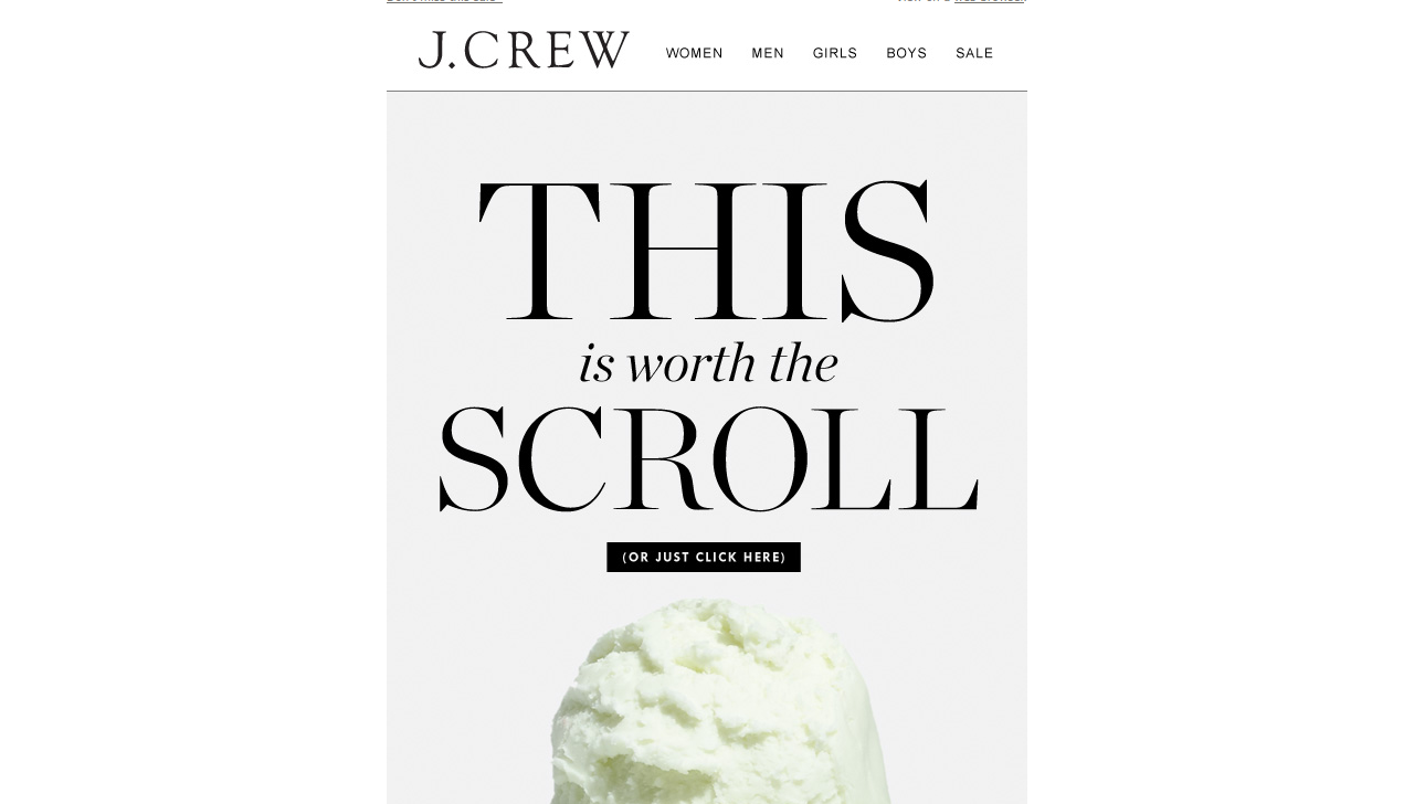
Mistake #1: Claustrophic 600px email width
While email was beginning to be used as a communication channel for the masses in the late 90s, the maximum display screen width was 1024×768. So email designers had a limited screen width of 600px to design their emails. Later on, with the increasing demand for responsive email designs, it was considered a best practice to keep a maximum width of 600px to ensure the email looked crisp on retina displays. Modern technology has progressed to the extent that modern mobile devices have a 1080×1920 resolution, so the designers are free to utilize the additional space.
Yet many email designers today also, commit the mistake of creating an email of 600px. This results in an email of 600px with white borders on either side. This is a huge turn off from the visual perspective.
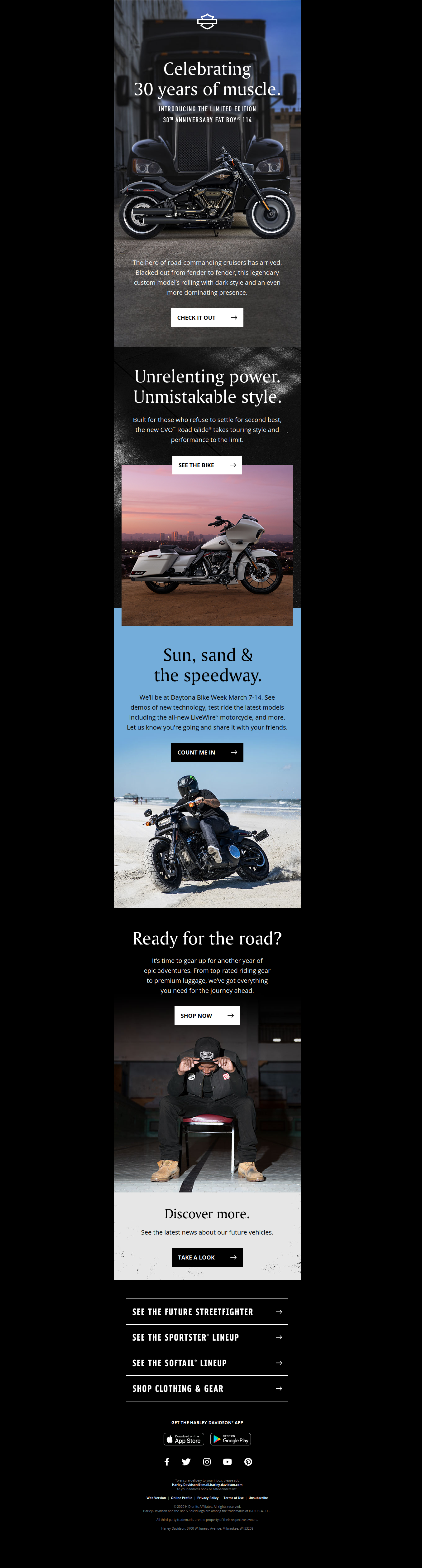
Correction: Stick to placing content in a width of 600px but create a full-width email wherein the background extend till the screen width. In the below email example by Harley Davidson, the black background stretches through the entire width of the screen while the content is present in the middle.
Mistake #2: Not Adopting a Mobile-first Approach
As per the latest Litmus Email Client Market Share, at least 43% of emails are opened on mobile devices. Yet, most marketers still prefer to create a main desktop layout and resize the elements to fit in a mobile layout. While this may reduce the overall time and efforts invested, you are compromising on the user experience.
Correction: By adopting a mobile-first approach to your email designs, you understand the importance of different element placement. Once you have an effective mobile layout, you can extrapolate it for a desktop view. In the email example below by Nordstrom, the desktop view has the navigation menu whereas, for the mobile view, the menu is hidden behind a hamburger menu giving more importance to the hero image.
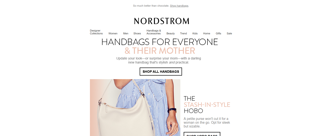
Nordstrom Desktop View
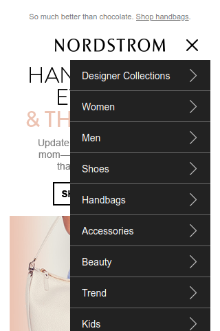
Nordstrom Mobile View
Mistake #3: Inconsistent Branding
Branding is your digital visiting card for your business. It helps your customers to recognize your emails. While this is very rare in this modern era, but still some designers forgot to maintain consistency across different communication channels. When someone opens an email, the attention first goes to the brand logo, the hero image and finally email copy. If you don’t manage to strike a chord with your subscriber even then, it will not be read.
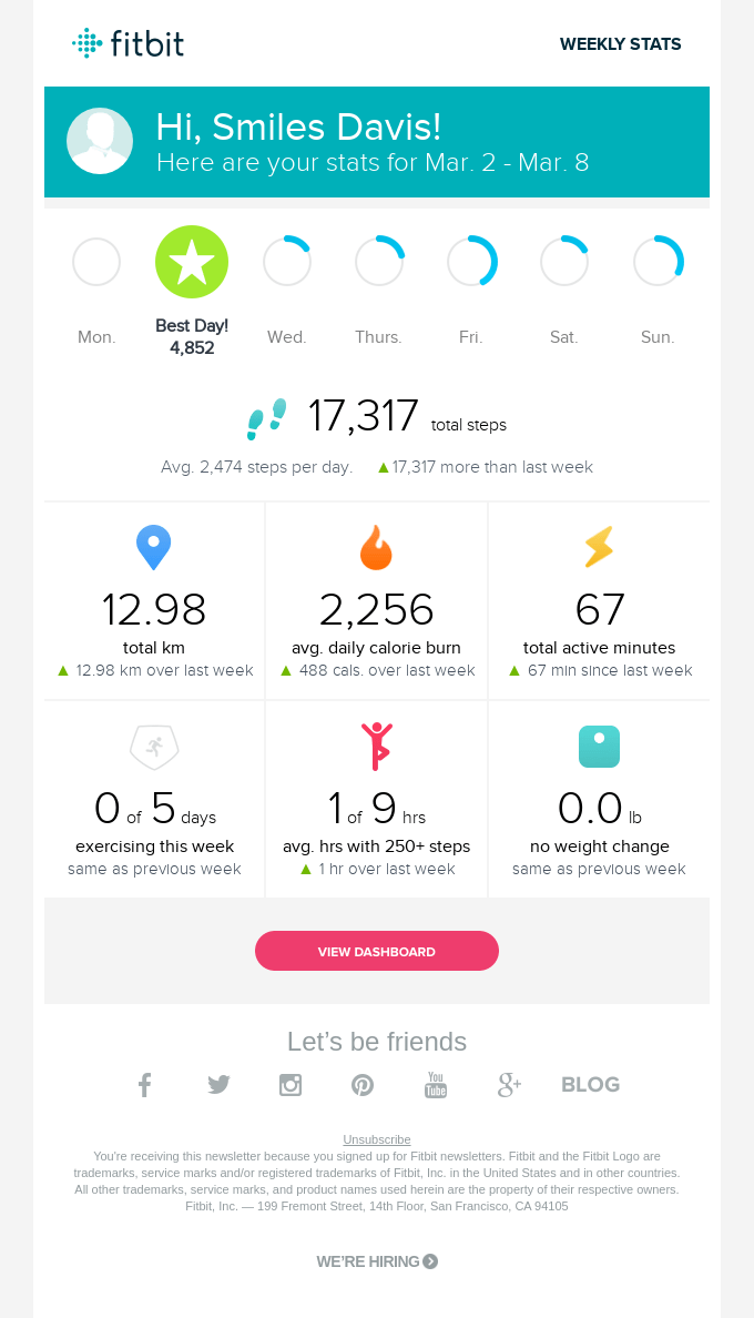
Correction: Your email should have branding elements to maintain consistency such as brand logos, consistent header, and footer. As seen in the example email below from Fitbit, they use the brand logo and the colors used are the same from the website.
Mistake #4: Not maintaining a text to image ratio
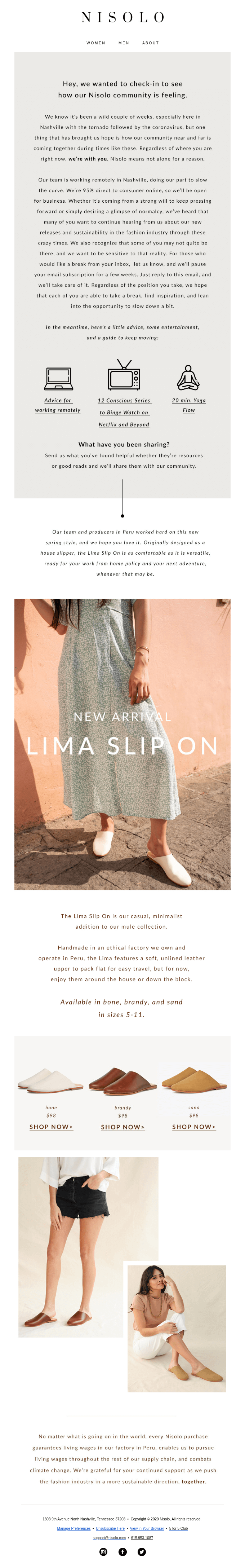
The adoption of HTML for sending emails opened up the gates to creating visually attractive emails using colors, paragraphing, and images. Ironically, some email designers get blinded in the pursuit to create an attractive email and forget the importance of text in email design. As a result, you have an email that is a single image that has all the important information. The downside to this is that such emails are considered spammy and hence ISPs & email clients tend to block images. So instead of seeing an email like the one below.
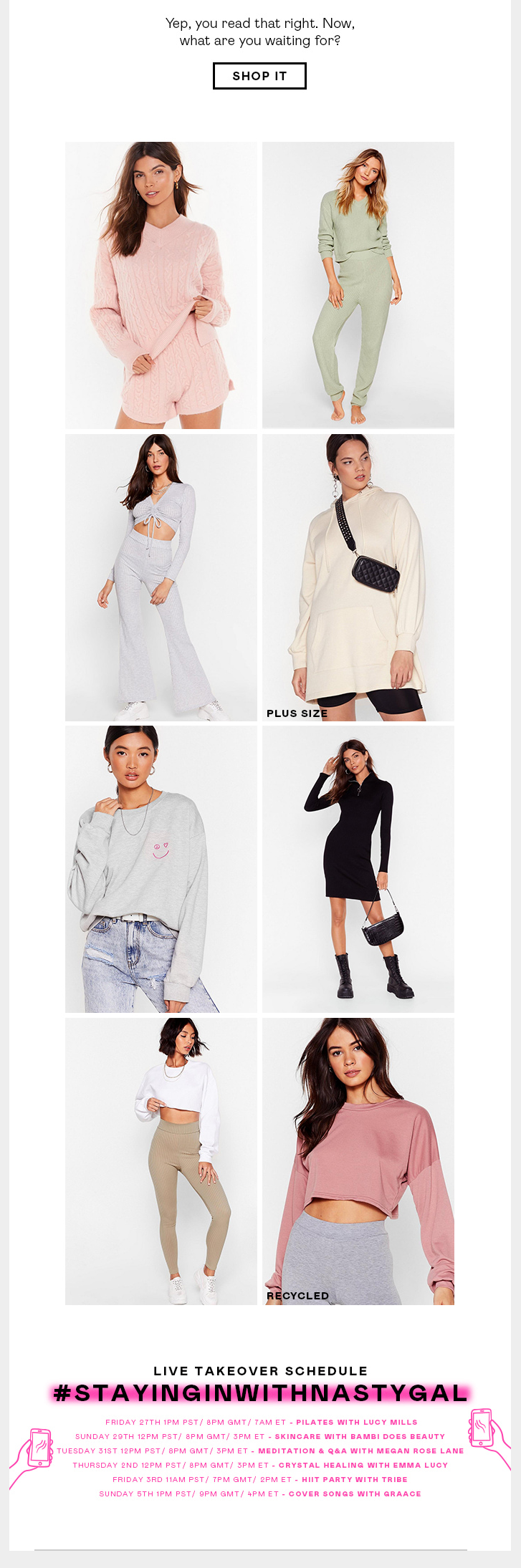
You get an email as seen below.
Corrections: Always maintain an 80:20 text to image ratio. This not only helps you avoid the ISP filters but also helps create context even if the images are disabled. Always use images that provide relevance to the adjoining text.
Mistake #5: Not implementing a visual hierarchy
People from left-to-right reading countries, such as English, Spanish, etc tend to follow a ‘F’ pattern while reading any literature. So, it is important to place the most vital information such as brand logo, Hero Image, email headline, salutations in the beginning of the email followed by secondary information.
Corrections: The goal of this is to hook the attention of the subscriber in the beginning itself and carry it ahead throughout the email. This is called visual hierarchy. The three prominent layouts used in email designs are:
Single Column
Double Column
Zig zag Pattern
Wrapping Up
Email design may look easy but a lot of preparation goes behind creating an email. Steer clear from the above mentioned mistakes for email design and contact us at [email protected] for any email template production queries.