Emails are the breadwinner for most marketers when competed against different marketing channels for the most return on investment. Not only do you have the power to reach out to your prospect with the aid of only their email address, but you also have the power to craft email copy that is personalized based on the recipients’ collected data. Earlier, marketers used to send an email with an assumption that their subscribers may like it. Thanks to data-driven email marketing, you send relevant and timely emails that your subscribers are expecting.
One question may pop in your mind, what construes as an effective marketing email that not only engages with the subscriber but also helps in converting them into eventual paying customers. This article is going to dissect an email and explain the anatomy of a well-performing email.
What are the barebones of an email?
If you browse through the most marketing emails that you may have received, you may notice patterns. On breaking down a perfect marketing email, you come to realize that a basic marketing email can be broken down into the following parts:
- Subject Line
- Pre-header Text
- Header
- Hero Image
- Body Copy
- Layout
- Typography
- Call to action
- Footer
- Email Signature
- Unsubscribe Link
Let us study each part in detail.
The subject line
The email subject line is equivalent to your attire for a social event. If it is too eccentric, people might avoid further interaction and if it is generic, you fail to stand out from the crowd. The purpose of the subject line is to set an expectation of what the email will convey. This, although, doesn’t mean you have the freedom to write paragraphs as your subject line. Most email clients have a limitation on the number of characters they can display as the subject line.
Gmail displays 70 chars maximum of your subject line. The rest of the subject line is truncated as visible in the example below.
 Apple Mail displays 60 chars of a subject line.
On the other hand, Gmail mobile restricts itself to display only 53 characters
So your subject lines need to be crafted such that it doesn’t exceed 53 characters or shouldn’t lose context when truncated.
Takeaway: Keep your subject lines between 53-70 characters and make them contextual.
What if your subject line is not enough to convey sufficient information to make the first impression? That’s where pre-header comes to rescue.
The pre-header
Pre-header or preview text is an excerpt from your email that is displayed with the subject line by most email clients. The purpose of doing so was to display the first sentence from the email copy to the subscriber before they open the email. Marketers have been using it to continue what was left out in the subject line.
From a design point of view, the preview text can be an actual excerpt from your email or create a custom one that is not visible when the email is opened.
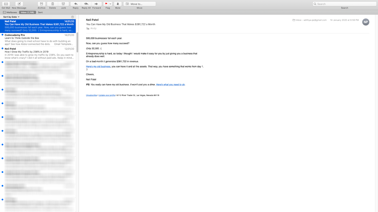
In the example below by Neil Patel, the pre-header text is taken from the email itself.
![]()
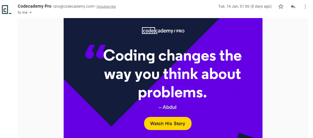
In the example below by Codeacademy, the pre-header is a custom message that is not visible when the email is opened.
![]()
Takeaway: Even if limited email clients display the preview text, it is good practice to include it.
Once you manage to hook on your subscriber with the subject line and preview text, it is time to move into the meat of your email i.e. the email body.
Email Body
The star of your email campaign is the body copy. This is where you tell a story, engage your subscribers, nurture & educate them, suggest relevant products or services, convert them with an actionable call-to-action.
The star of your email campaign is the body copy. This is where you tell a story, engage your subscribers, nurture & educate them, suggest relevant products or services, convert them with an actionable call-to-action.
Layout
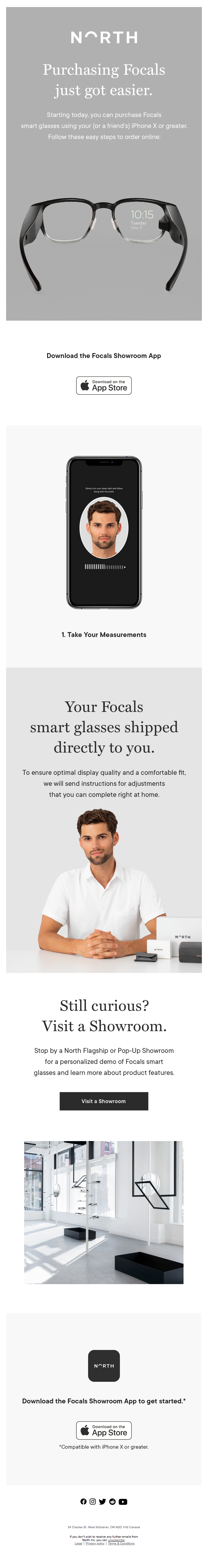
The email layout is a vital aspect of email design as it dictates the placement of different email elements and also the interaction of the subscriber with each element. Most marketing emails follow either a single column layout like the following email by North Smartglasses.
Or split the content into two sections called the ‘Two-column layout’. In the example below by GoDaddy, the second section is divided into two portions to reduce the overall email length, while giving justice to both portions.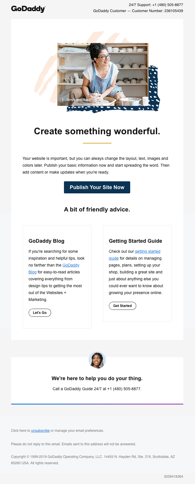
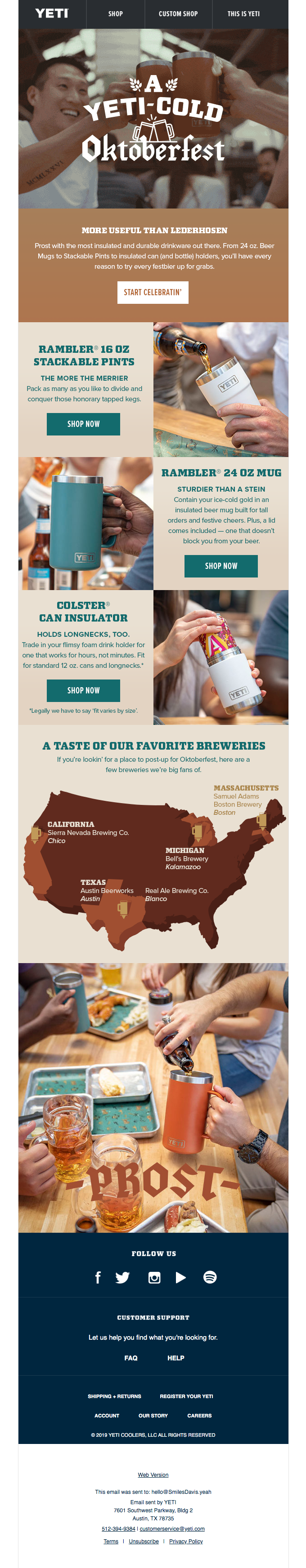
Another version of the Two-column layout that draws the benefit of visually segregating individual sections is the zig-zag pattern. In the email example below by Yeti, individual sections have alternating patterns of image and text mixed in to give equal importance to each section.
Header
The first fold of your email is the section that gets the maximum attention. Coming from reading the subject line, the subscriber will be looking for the continuation of the suspense generated. The level of attention gradually decreases as the subscriber reaches the bottom of the email. So, the header must carry the most vital information or must be engaging enough to maintain the attention capture till the end.
In the welcome email example below by Barilla, the first fold has multiple elements but your attention immediately goes to the image with the brand logo and the word ‘Welcome’ spelled using cooked spaghetti. The image is vital to leave a lasting impression about what brand it is and what is their specialty. The image in the first fold is called the Hero image and its purpose is to convey what would have taken a paragraph of words to explain the email’s intent.
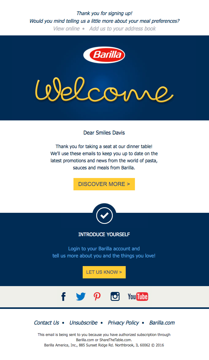
Takeaway: Whether you choose to feature a hero image or not is your brand’s decision, yet it is important to feature your brand logo, a view online link, and the most important information in the first fold to set the conversation rolling.
Email Copy / Typography
The textual portion of your email is the email copy. From a designer’s point of view, you need to take care of the typography. Typography is the technique of arranging the text in order to be easily legible as well as readable. Typography includes the fonts used, font size, line height, line spacing and alignment to an extent. As the best practices, it is advisable to stick to the system compatible fonts and any fancy fonts should be only used in an image. The ideal font size for email copy is 14px with 21px line spacing.
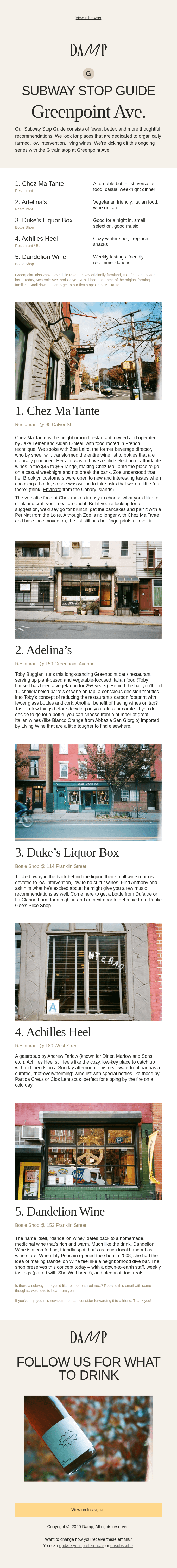
In the below example by Damp, the brand logo has a unique character in it and so it is placed as an image. The rest of the copy is placed as a selectable text.
Wrapping Up
No matter what kind of emails you’re sending, the goal is to have them opened, read and responded to. If that’s not the goal, I challenge you to ask yourself why you’re sending the email in the first place.
It’s time to send better emails. I can’t wait to read yours.